


DeMorgan
-
Posts
277 -
Joined
-
Last visited
-
Days Won
1
Content Type
Profiles
Forums
Store
Events
Posts posted by DeMorgan
-
-
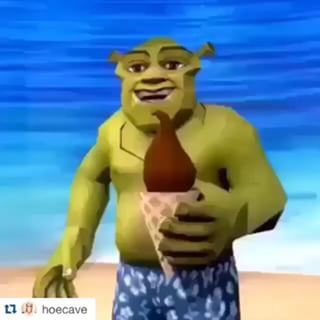
This is probably the dankest ice cream meme that exists:
-
 4
4
-
-
1 hour ago, DannyFenton123 said:
*NARROWS EYES IN ALL CAPS*
*WIDENS EYES IN ALL CAPS WHILE INCREASING POST COUNT*
-
2
-
-
Just now, DannyFenton123 said:
It was a genuine reaction, I-I swear!

Sure... I'll give you a pass on this one this time, though...
-
2
-
-
1 minute ago, deltaX said:
You can chose pulp or no pulp.
Hmm, I guess that I'd still stick with the apple juice. I was going to go with the orange juice if it was pulpless, but sometimes it's still just too heavy. Apple juice is nice and light.
Would you rather be a dalek or a doctor?
-
Just now, DannyFenton123 said:
*cringe*
You tryna out post me, mate? That seems like a pretty minimal post to me...
-
6
-
 2
2
-
-
1 minute ago, deltaX said:
Cake, if I was ice cream I might melt!
Would you rather drink apple juice or orange juice?
Does the orange juice have pulp?
-
2 minutes ago, DannyFenton123 said:
I ... LOVE
HAHA YOU CAN'T BE A REAL AROMANTIC THEN LOL I TOLD YOU GOOD THING I WAS HERE TO FIGURE THAT OUT. EXTERMINATE!!!
-
5
-
-
I SHOULD REALLY BE DOING MY HOMEWORK, BUT AM HANGING OUT ON AROCALYPSE INSTEAD. I DON'T EVEN THINK THAT I'M AROMANTIC; WHAT AM I DOING WITH MY LIFE???
-
4
-
-
Short hair. Long hair has too much potential to be annoying.
Would you rather be cake or ice cream?
-
13 minutes ago, Blue Phoenix Ace said:
Why do you need the create button? There's a "start new topic" and "reply to this topic" button at the top. I'm not saying you're wrong, just trying to figure out what the use case is.
You're viewing this from the functionality point of view, not the usability. Sure you can do that, but someone (particularly older folk) who are used to using the "create" button could get confused. That said, you should just kill the "create" button to fix the problem; it's redundant.
13 minutes ago, Blue Phoenix Ace said:I can actually fix this with my mad CSS skills, hang tight.
As I've just noticed, you probably need to add a "quote" button to the post options, too. If I want to quote say, a book, I have to quote someone else's post and then change the name and delete all the text. Kinda annoying. But as for your mad CSS skills, it's non-trivial that the "forum" and "chat" tabs also disappear when you tile the page. It'd be great if you could fix that.
Finally, I have some requests from a bunch of us on chat right now. Obviously the front page needs improvement, but you're obviously aware of that. More specifically, we need at least some sort of a blurb on aromanticism to gain us pagerank on search engines. A Google search for terms like "I don't want relationships" or "non romantic" or "i want sex but not relationships is something wrong with me" need to lead to this site, not AVEN and buzzfeed articles. Similarly, that horrendously-fonted name in the upper right needs to be changed to something more reflective of the site's purpose a la AVEN. Someone who is not very familiar with the community wouldn't get why the site is "Arocalypse". Something like "Arocalypse: the aromantic community" or something. All of our incoming members are from AVEN or ace/aro communities on Reddit, but we need to try to gain people unaware of what aromanticism is. That should be the main goal.
Also, I don't think that the search bar works in the slightest.
-
1
-
-
1 hour ago, Blue Phoenix Ace said:
This is more of a "philosophical" problem as we say in the programming world. There's no clear solution in other words.
Fine, but there are some serious UI problems. If you tile the page on one side of your screen (in Chrome, anyway), the "create" button disappears. Similarly, the "unread content" button only exists while the page is tiled. The "Like this" buttons jump to the left of the posts above the "quote" button, which increases the length of the page by one line per post. Over 20 posts, that's 20 lines that could have been text making scrolling take longer and adding more whitespace.
But thanks for the Lucida Sans Unicode. I feel at home now.

-
I just noticed: if you go search -> advanced search, it redirects you to a "page not found" page. Expanding on what I said above, the site needs a lot of aesthetic improvement. The name in the upper-right shouldn't be in that horrendous font and the overall format of the pages are painful to the eye, especially if you resize the window or tile it.
-
Quote
Yes, the likes are still limited!

Speaking of which, you should like my posts. Ah, you need more fonts! I exclusively use Lucida Sans Unicode on AVEN, so you should include that.
-
I think that I may be gray-romantic because I'm still not completely sure exactly what "romantic attraction" is. I've always believed I was romantic, but I'm not sure anymore. Time will tell...


CAPSLOCKIA
in Aro-cade
Posted
REAL AROMANTICS EAT ICE CREAM